Background

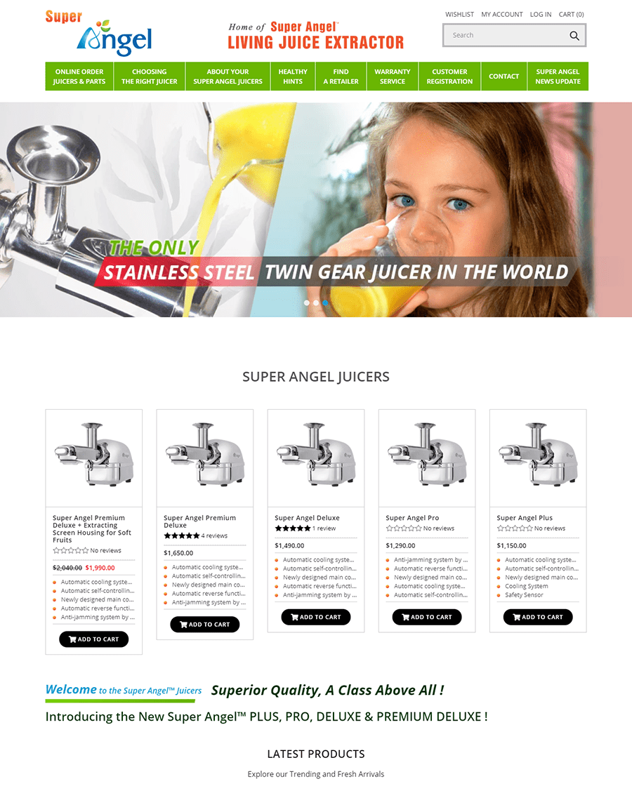
Super Angel Juicers is a company that sells high quality juicers on the web. Naturally, any company that sells via the internet needs a website that can keep up with their needs. They have many products that the public will buy, but no one will buy from a site that is frustrating to navigate and use. The company was seeing that many consumers were reporting frustration with their original site’s unintuitive layout and non-working links within the site. Due to the frustrating site layout and difficulty finding the consumer’s preferred products, consumers visiting the site were not buying items.
The Powerphrase Solution
With the help of Powerphrase, Super Angel Juicers fully redesigned their website. They streamlined and reorganized their item categorization system, making the site more intuitive for consumers to navigate through inventory. The redesigned site also included chat support, helping to guide consumers toward the product they were hoping to purchase.
New categories were placed within the site’s header to make navigation easier for consumers.The new website included new search category features, making it possible for consumers to refine searches based on customer reviews and based on a brand. Product search functionality was also adjusted to make the product search bar a different color from the surrounding header, helping the product search bar stand out to the consumer. This made it possible for consumers to find high quality products. Additionally, consumers were now able to find products from brands with which they were familiar. The new website also displayed similar items or items also purchased by consumers who had viewed that item.
Super Angel Juicers’ redesigned site boasted improved “Add to Cart” functionality, as the previous site tended to experience many errors and problems in this area. Along with improved “Add to Cart” use, Super Angel Juicers’ new site included a streamlined payment gateway. Between these two updated user experiences, Super Angel Juicers significantly reduced the possibility of consumer frustration during time spent on the site.
Once a consumer had added a product to their cart, Super Angel Juicers added a comparison chart to their checkout area. This comparison chart showed Super Angel Juicers’ price for an item while also displaying the prices for the same, or similar, items offered by Super Angel Juicers’ top competitors. This simple chart highlighted the difference in prices between Super Angel Juicers and the other ecommerce sites in this market. Adding this comparison chart also eliminated the need to look at competitor’s prices on other sites, making it more likely that the consumer would remain on Super Angel Juicers’ site.
Results
Since its launch, the new Super Angel Juicers website has received almost 200,000 page views and has shown a 17% increase in site traffic over the previous site. Data have revealed that 27,000 of the 200,000 site views have come from new users, meaning that the new site has
brought a large quantity of new users in. Super Angel Juicers also observed that the price comparison chart included in their checkout page increased consumer purchases by 22 percent.
